Bytesnet Corporate Identity Case
Bytesnet delivers first class datacenter services for customers that require high levels of availability, security and power density. WEBER Creatives’ mission was to position Bytesnet as a professional, reliable, experienced and innovative company.
Concept
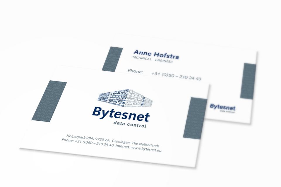
After doing research consisting of a target sector research and a competitor research, WEBER Creatives came to a certain trademark for Bytesnet. A stylized data-server rack build up from bytes written in binary code. Using a ground level perspective the logo imbues power and sturdiness, also making use of two colors give the logo more depth, emulating light and shadow. By placing the title below the actual trademark it becomes unified as a whole. Therefore it’s easier to resize and edit the trademark as it is.
Production
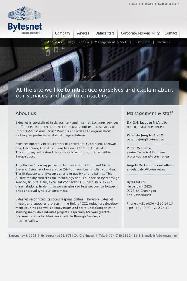
WEBER Creatives has developed the complete stationary, and in order to protect the identity a branding manual has been made. This branding manual describes the ‘do’s and don’t’ to maintain a professional and consistent look when communicating to the customer. Besides developing the stationary WEBER Creatives has also designed the website for Bytesnet, by doing so, a photoshoot was required, since the theme was server racks and machines. A lot of editing has been done to the pictures, like using depth of field effects. These pictures have furthermore been used in folders and on ICT related fairs.